Text Blocks Paragraph
Droopler Documentation
Full Example
This paragraph is a typical component of every company website. You can use it to list some features or present a list of guest/sponsors at your event. Each item gets its title, icon, description and CTA button. So many possibilities!
Main Title
Basic Example
Here you can see a simpler version of Text Blocks Paragraph. There are no icons or CTAs. It looks clean. Have you noticed an increased number of columns? With Droopler you can choose how many columns you want to have in one row (1-12).
Main Title
Theme Invert and Full Width Example
Choose the "Invert theme" option to invert all paragraph colors. The background becomes dark, the text is white now. Choose the "Full width" option to span the paragraph 100% width.
Main Title
Lorem ipsum dolor sit amet, consectetur adipiscing elit. Etiam cursus tristique dui dignissim gravida.
Nodes in Grid Example
This paragraph accepts not only text blocks. You can put a node inside it. Check the "Enable grid" option to put everything into a grid.
Main Title
Lorem ipsum dolor sit amet, consectetur adipiscing elit. Etiam cursus tristique dui dignissim gravida.
Tiles Example
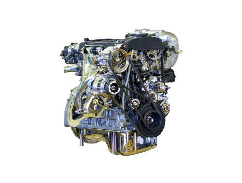
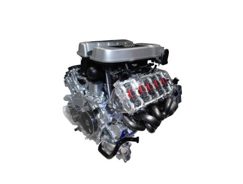
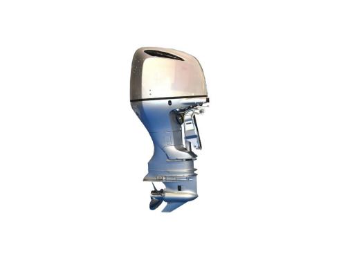
You can convert all paragraph items to clickable tiles with an image background. In this example, we enabled the "Paragraph header in two columns" option.
Main Title
Lorem ipsum dolor sit amet, consectetur adipiscing elit. Etiam cursus tristique dui dignissim gravida. Duis tristique sem non interdum ultricies.
